Introduction
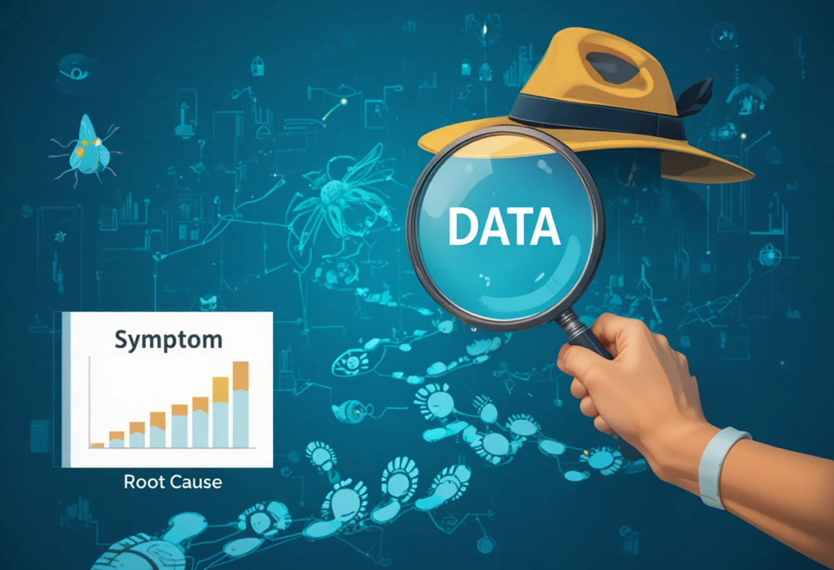
In today’s fast-paced, data-driven world, Technical Program Managers (TPMs) need more than just technical and project management skills—they must also master the art of data storytelling. Numbers alone rarely inspire action; it’s how you present them that drives alignment and decision-making.
Why Data Storytelling Matters for TPMs
Stakeholders come from different backgrounds—engineering, marketing, operations—and each interprets data differently. By weaving insights into a clear, compelling story, TPMs can bridge these gaps, foster collaboration, and push projects forward.
Key Principles of Data Storytelling for TPMs
1. Start with the ‘Why’
Before showing metrics or dashboards, clarify why the data matters. Connect the numbers to a business objective or a pressing challenge.
2. Use Visuals Strategically
Charts, graphs, and infographics should highlight trends and insights—not overwhelm with clutter. Focus on the one or two most critical visuals per discussion.
3. Translate Technical Jargon
Avoid overly complex terms when speaking to non-technical audiences. Simplify without losing accuracy to ensure everyone understands the takeaway.
4. Frame the Narrative Around Impact
Rather than just saying, “Feature X reduced processing time by 30%,” connect it to real-world benefits—such as cost savings or faster customer onboarding.
Practical Example for TPMs
Instead of sharing a raw table of bug counts, a TPM might say:
"We resolved 45% of critical bugs in two weeks, reducing customer complaints by half, which directly improves our churn rate projection."
This ties metrics to outcomes, making the data more persuasive.
Common Mistakes to Avoid
- Overloading presentations with too many KPIs.
- Failing to tailor the story for the audience’s background.
- Relying on visuals without context.
Conclusion
For TPMs, mastering data storytelling isn’t just a nice-to-have—it’s a career-defining skill. By turning numbers into narratives, you create alignment, inspire action, and become a trusted leader in decision-making.
FAQs
Q1: How can a TPM improve their data storytelling skills?
Practice summarizing complex reports into 2–3 key takeaways and present them to mixed audiences for feedback.
Q2: What tools can help TPMs with data storytelling?
Tools like Tableau, Power BI, Google Data Studio, and even Canva can enhance visuals and clarity.
Q3: Should TPMs always use visuals in their storytelling?
Not always—sometimes a simple, impactful statement backed by data can be more powerful than a graph.


.png)
.png)
.png)
.jpg)
.jpg)


